The homeowners were looking to take their closed off and worn out kitchen and transform it into a space that not only looks great but also functions. They love to entertain and host weekly dinners for up to 10 people. The current kitchen makes this awkward. Cooking is a passion for them and the current kitchen doesn’t lend itself well to a true cook.
We did have challenges from the start. The home is in a historic district so this made making any exterior changes off limits. This meant that the existing stained glass window needed to remain as is. The kitchen also sits on a concrete slab so in order to keep the kitchen on budget we decided to keep the appliances and plumbing in the existing locations. The last challenge was the awkward soffit above the stove area and the hallway. This soffit needed to stay as it was a chase for HVAC for the upper levels of the home.
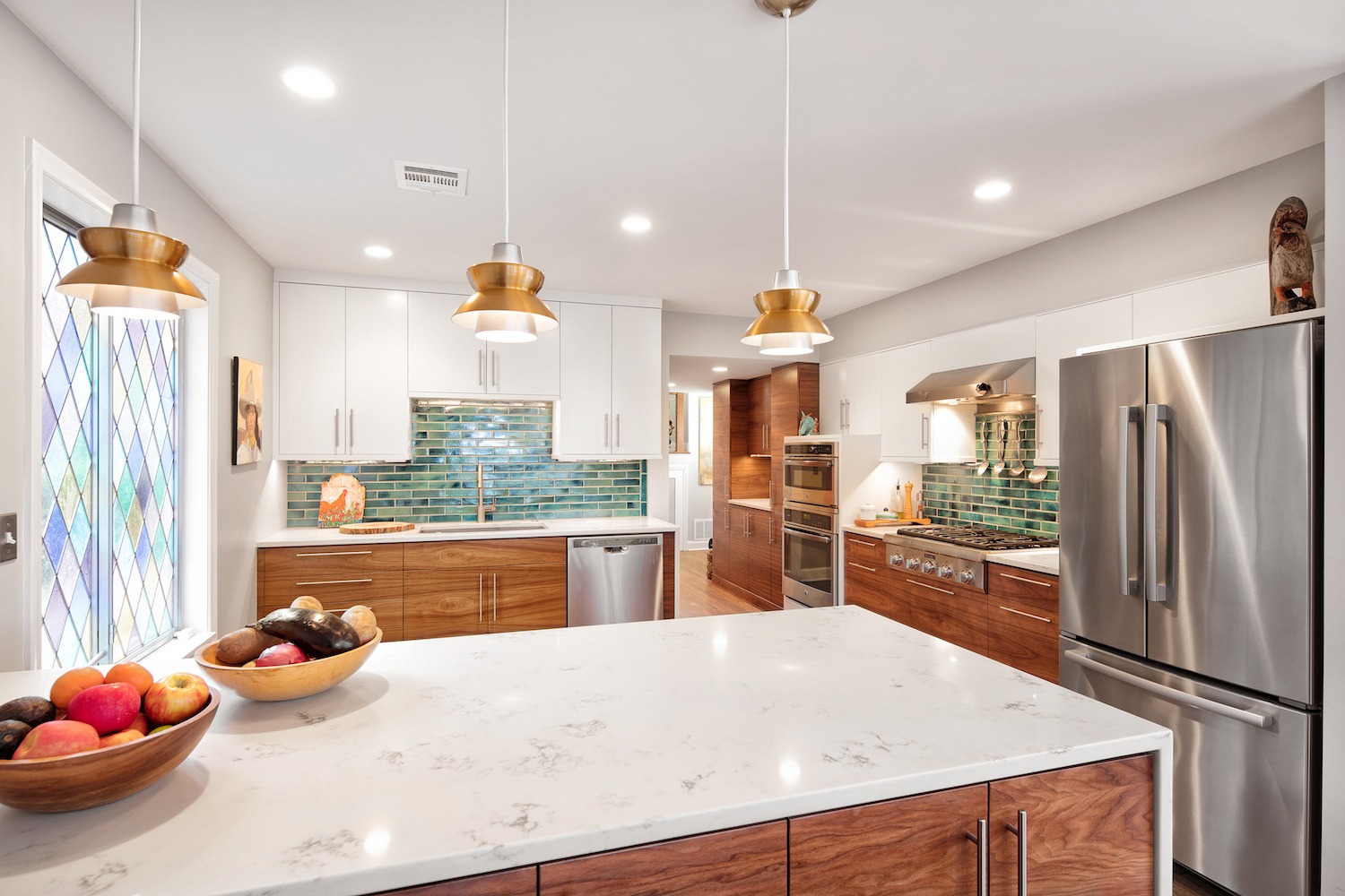
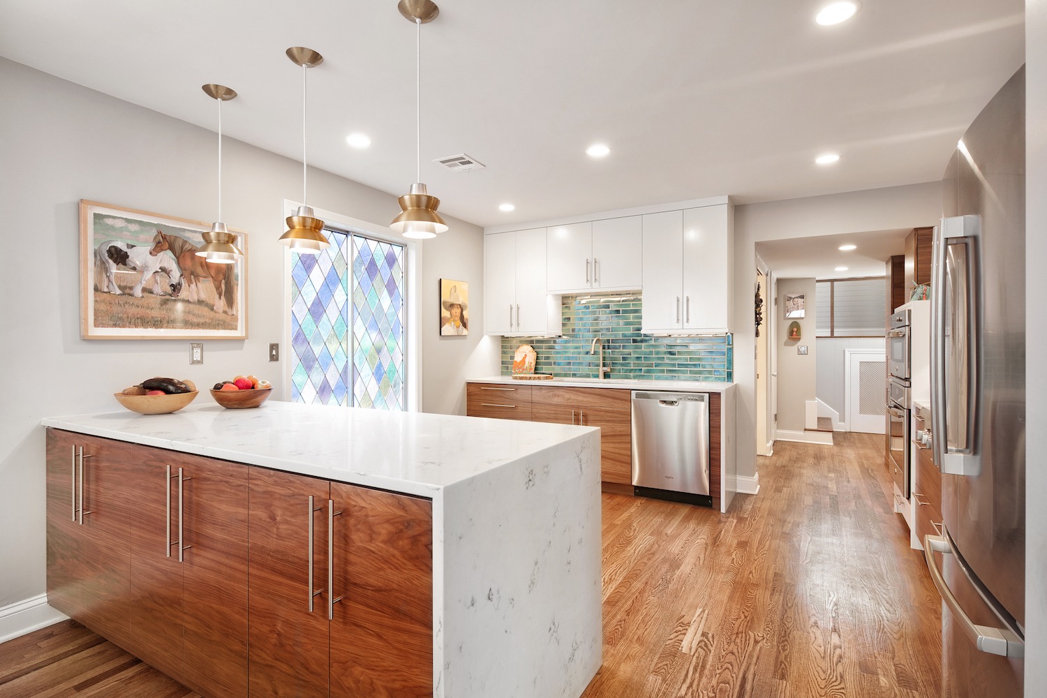
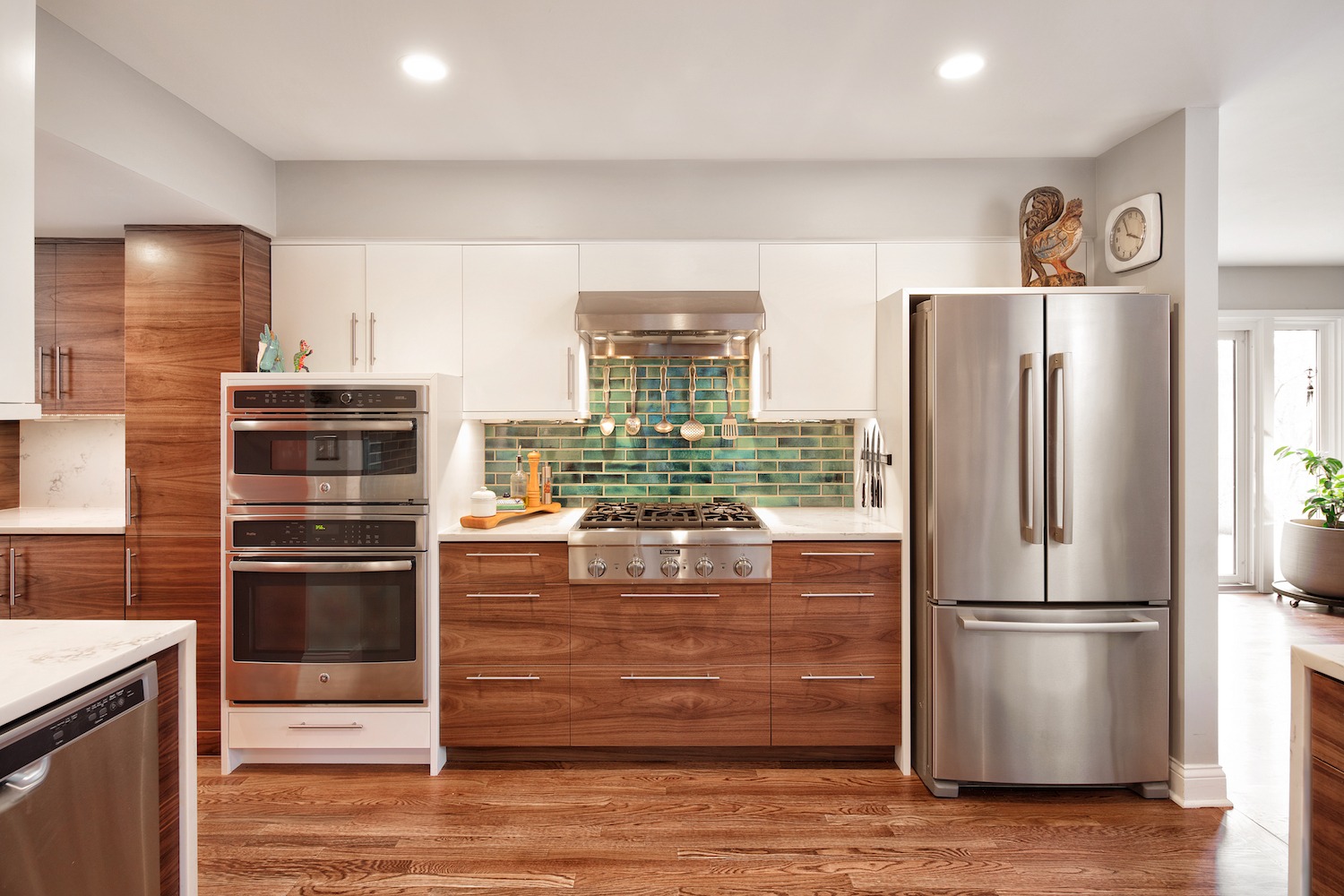
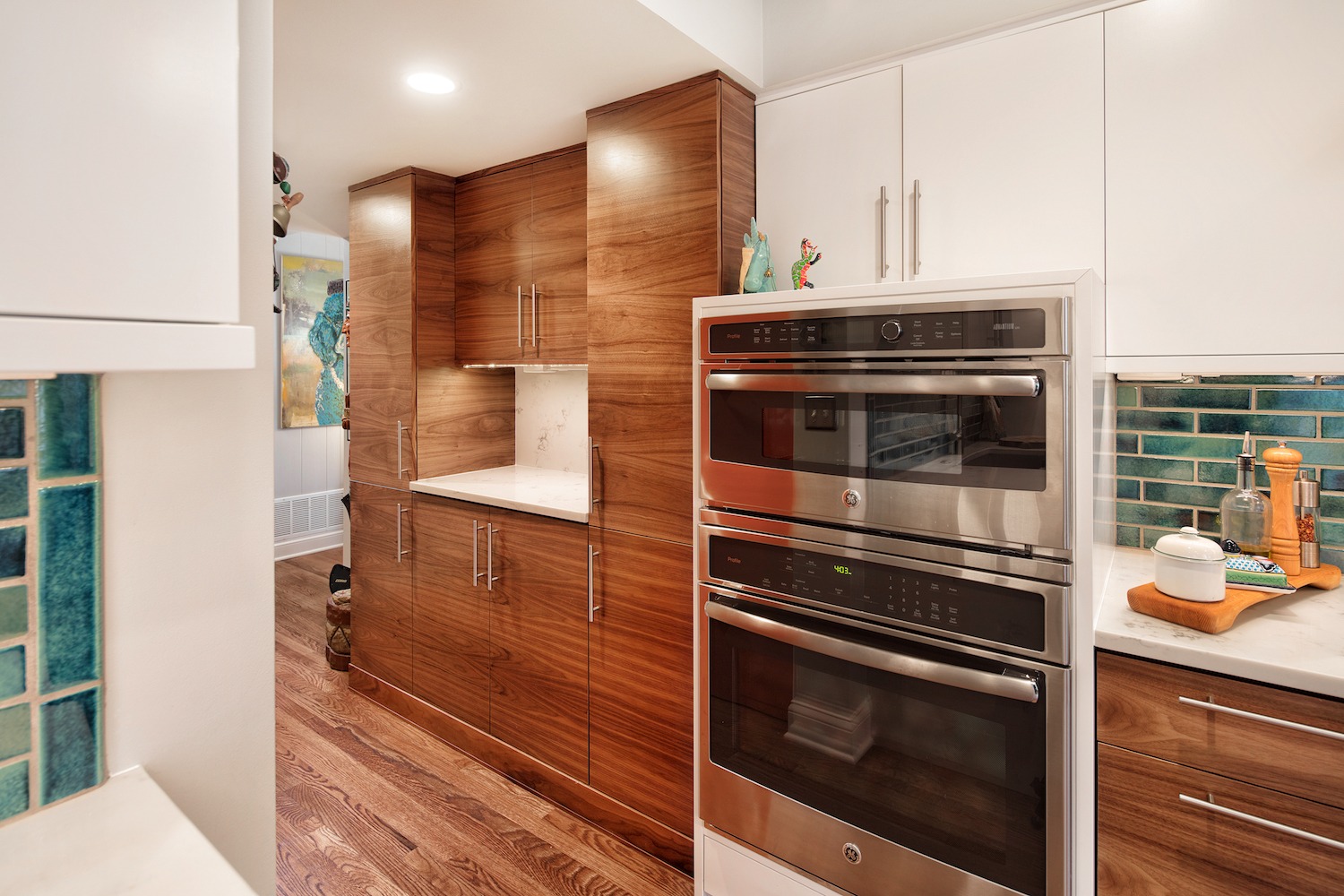
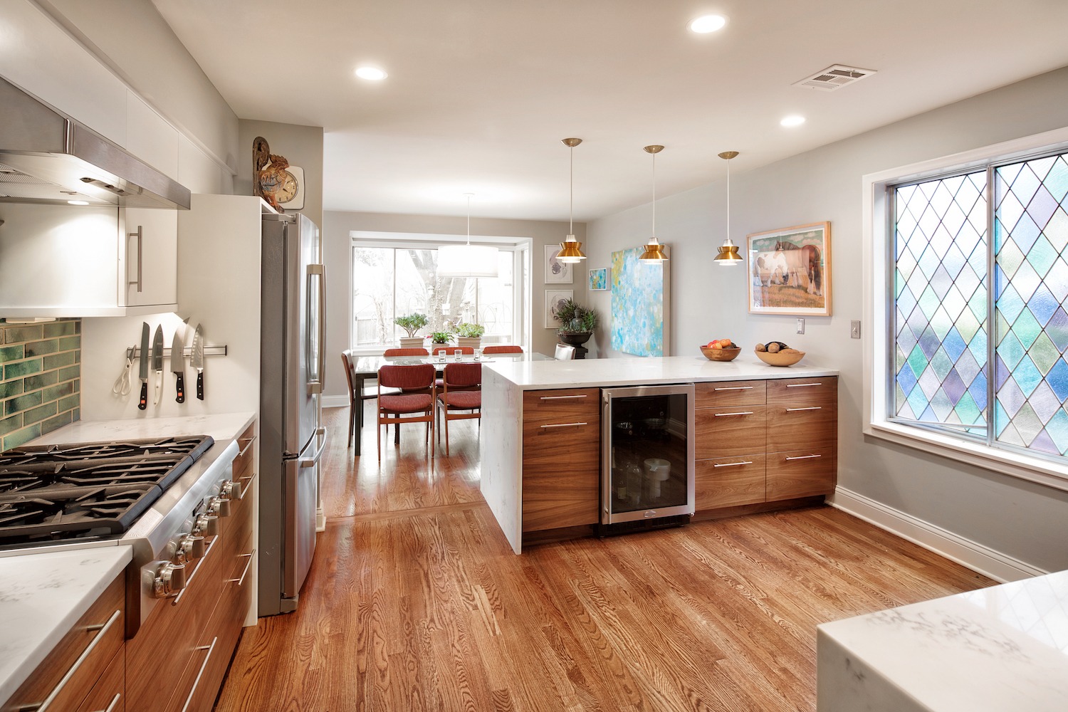
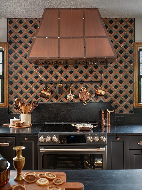
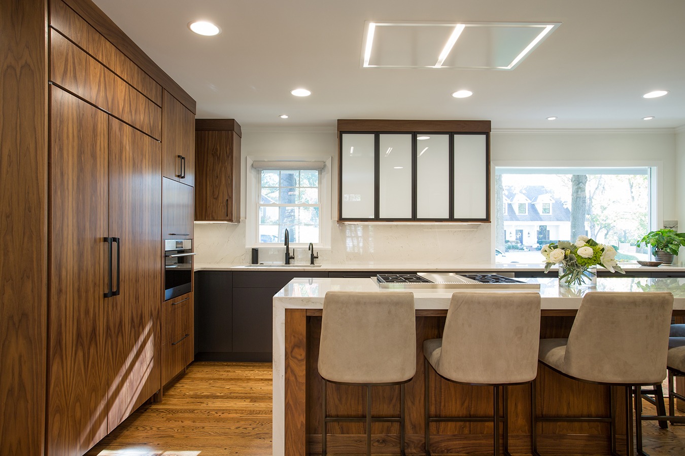
The biggest impact was in the removal of the wall that separated the kitchen from the dining room. This allowed for a ton of natural light to pour in from the east facing dining room windows. This also allowed for better flow during their Sunday dinners with friends. In place of the wall we brought in a large peninsula with storage on both sides as well as a small beverage refrigerator. The large island is the perfect place for meal prep and is fantastic for setting food out for a buffet. The cooktop, with its large hood above are a nice focal point in the space. To the left of the cooktop you will find an oven and a combination microwave/oven allowing the homeowner to have the function of a double oven when needed. The refrigerator is kept in its original location but has been dressed up with cabinetry and tucks in behind the wall so it isn’t visible from the dining room. Lastly, one of the bigger changes we made was in the small hallway that leads to the powder room and front entry. We took out an awkward closet that closed off the space and put in a coffee bar with pantry cabinetry to the right and left. This brought in a ton of storage but also opened up this hallway and made it a stunning entry into this kitchen.
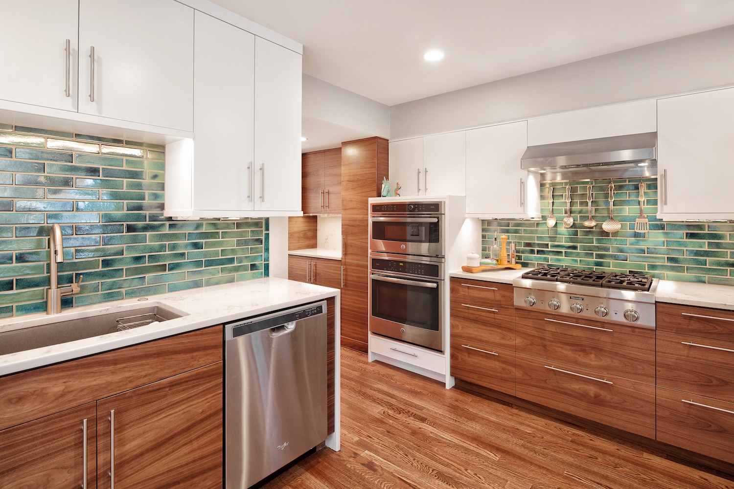
The finishes are what set this kitchen apart. Hardwood floors to match adjacent spaces were brought in and will be more comfortable under foot than the previous tile. It also ties the space together with the dining room giving it a larger feel. The cabinetry is a mix of natural walnut that is book matched for a stunning effect and painted white cabinetry above to give it a lighter feel. Quartz countertops with a subtle marbling also brighten up the space but also function beautifully. We ran the quartz down the sides of the island and sink area for a dramatic look and it will also keep the sides of these cabinets from getting beat up in these high traffic areas. The final touches consist of a stunning teal backsplash tile that pulls out the color in the stained glass and the fun light fixtures over the peninsula.
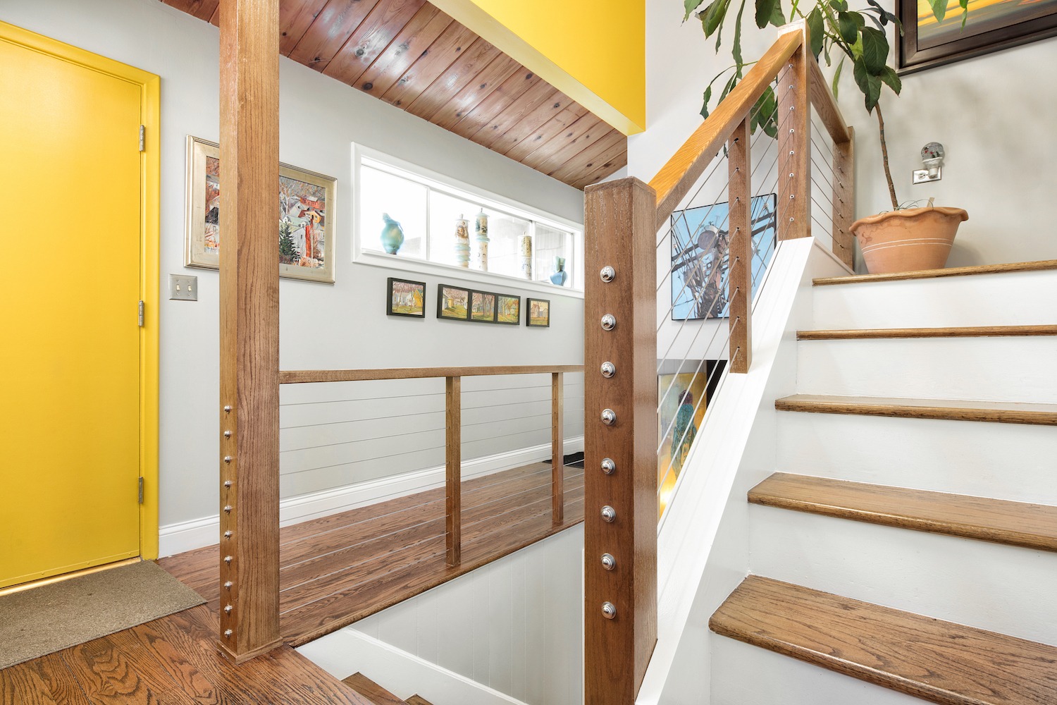
The front entry of the home was also addressed. We removed a tired and boring railing and replaced it with a cable system. This required some re-working of the stairs but it was worth it! The bright new paint color provides a fun backdrop and nice welcome to this home. The quality craftsmanship and attention to detail set the stage!
The homeowners were thrilled with the outcome and so are their friends! With so many challenges and a layout that was restricted we were still able to make meaningful changes and improvements.

